It wasn’t really supposed for the New Year, but I’ve had plenty of free time on my hands
during the holiday break, so here it is already: a brand new version of my blog
Why?
Where to start? I got increasingly annoyed by the old version. The design started seeming boring and blunt. The code started growing unstable. It was using the Micrus framework, which I stopped supporting a year ago. It was using Micrus Assetic – an outdated method of asset management, which highly depended on the server configuration and binaries installed. The deployments were “iffy”, to say the least. I was afraid of sending even small changes to the server, for fear something might blow up again. Some small things I didn’t even notice were wrong: like still warning about Google Analytics tracking, even though I migrated to Matomo ages ago.
What changed?
I decided to keep it simple. To go with a “less is more” approach. I’ve removed soooo many features that just weren’t useful enough.
I used to have an admin panel: except I didn’t need any fancy editor, the main content was written in an (enhanced) Markdown anyway. So for this version, I’ve decided for a filesystem-based approach: I’ve ditched the database completely, I don’t need any ORM, I don’t need an admin panel. I just have a bunch of SUML files tracked by GIT. Using Esse CMS.
I used to have three language versions of the UI – but why? I don’t think anyone really cared about not seeing the names of the categories in Polish, when most of recent my posts were in English anyway. So now the posts are still available in the language(s) they were written in, but I’m no longer maintaining the multiple versions of the UI, or the features to filter content by language. What a relief!
I used to have a “random post” box. I used to have tag clouds. I used to have an embedded Twitter timeline.
I used to have the latest posts on the “about me” page (really?). I used to have a link shortening feature
(”avris.it/l/<whatever>”) that I’ve never used, not a single time.
I used to have a separate controller and database fields to support redirects for legacy URLs from the even earlier version.
I used to have database fixtures. I used to have a console command to export legacy comments to Disqus.
I used to have tooltips and popovers.
All gone now!
I replaced the infinite scroll with... just loading the whole page at once 
IntersectionObserver API.
Way simpler than infinite scroll or pagination – which aren’t really necessary with this amount of data.
Oh, and the website is now using a fast an sleek Symfony setup with an HTTP cache
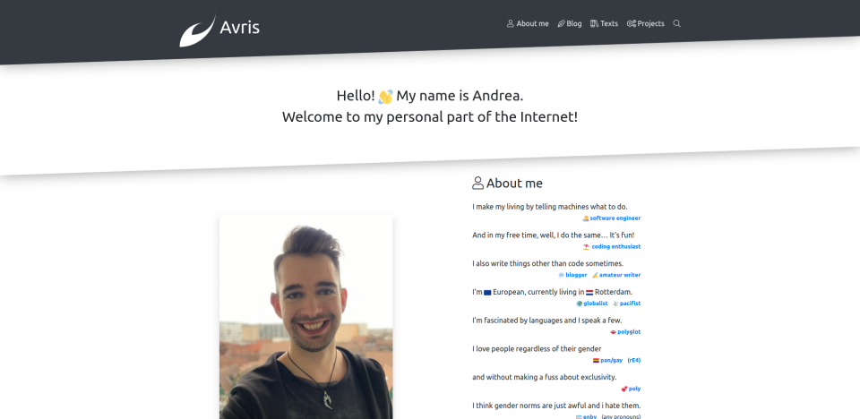
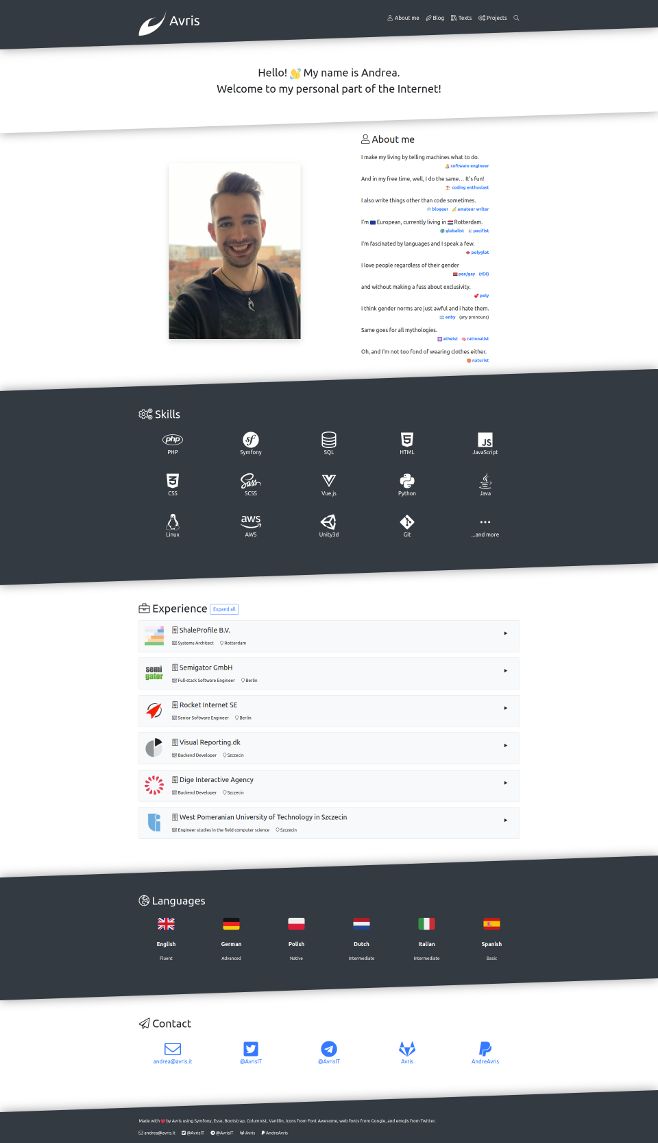
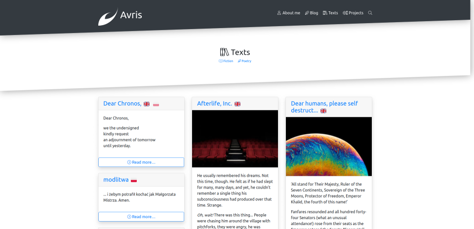
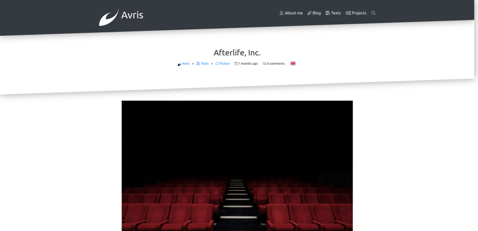
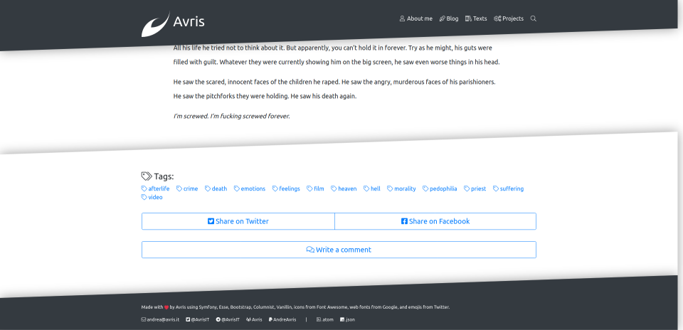
Design-wise, I use the default Bootstrap theme, with only minor changes of variables and minimal additional styling. The main feature, obviously, are the tilted elements. That’s enough to add some personality to the website, without making it overcomplicated. Compared to the previous version, it’s way more contrasting, better tailored for wider screens and clearer.
Overall, 41090 (!) lines of code were removed:
There’s nothing else in the (programming) world I love more than removing useless code!
Deployments are now stable, simple, reproducible and revertible, thanks to Symfony, Webpack, lack of database (no db = no migrations), and most importantly my recent child: Avris Deployer.
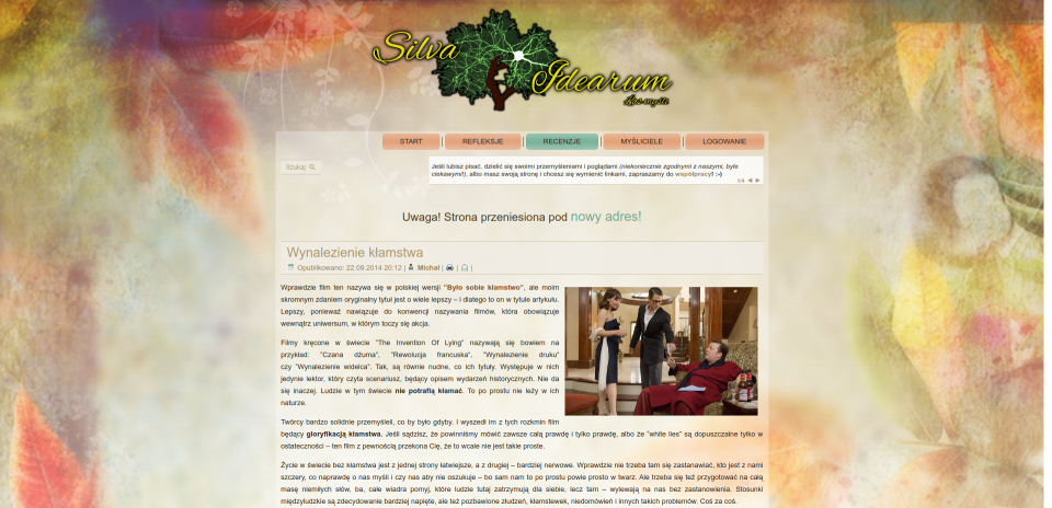
Version 1 (”Silva Idearum”)
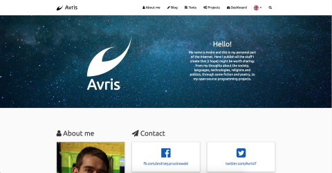
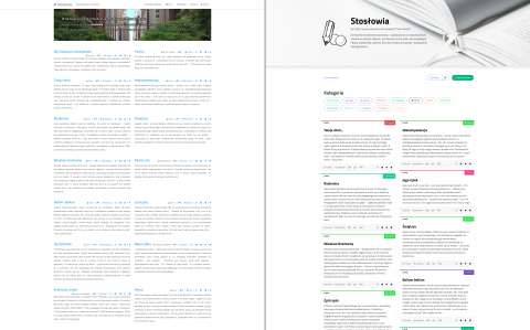
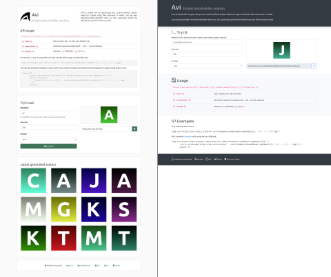
So, to finish this post, let me just quickly show you the four versions I’ve been through so far:
My first blog was called “Silva Idearum” (Latin for “Forest of ideas”). It was anonymous, spirituality-oriented, Polish-speaking, Joomla-running and with a “too much” design.
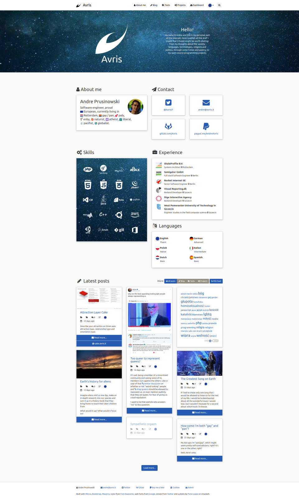
Version 2
After coming out and becoming independent from my parents, I was finally able to put my name on my posts. New domain and a redesign was also in place.
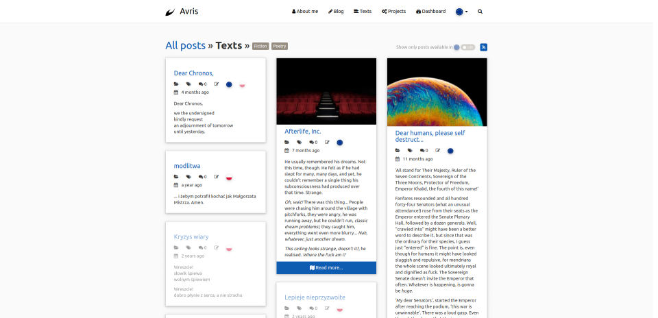
Version 3
As announced in Brand new blog…
 Avris
Avris
 Avris
Avris

