It’s honestly diffucult being a webdeveloper in the world of shitty websites. I guess that’s how hairdressers feel when they see my pathetic hair after it’s been a while since my last visit...
But the thing is, even though it’s technically easy to use scissors and clippers, I don’t do that on my own hair, I leave that to the professionals.
It’s great that HTML is so easy to learn and that many schools teach it to children. But its simplicity is also a curse, leaving some people convinced that “they can now do programming” (HTML is a markup language, not a programming language) and that the whole thing is easy.
And, admittedly, writing code that does stuff and solves problems isn’t that hard either, especially if you have Google and StackOverflow on your side. The hard part is to write this code is such a way, that another person can understand it, maintain it and modify it, so that groups of programmers can colaborate on it together, so that it can easily be kept up to date... I’ve learned how to write code when I was twelve. But learning, how to write good, maintainable code, took me years of professional work, and I still have a lot to learn.
It’s also difficult for the professionals to keep up to date with technology, it changes so rapidly. For example, a teacher of webdevelopment at a university (!) was teaching my class how to use HTML4 and how to deal with the ISO-8859-1 encoding, even though both HTML5 and UTF-8 have been standards for years!
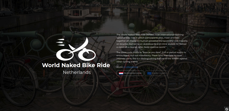
The same goes, I guess, for the author of wnbr.nl:
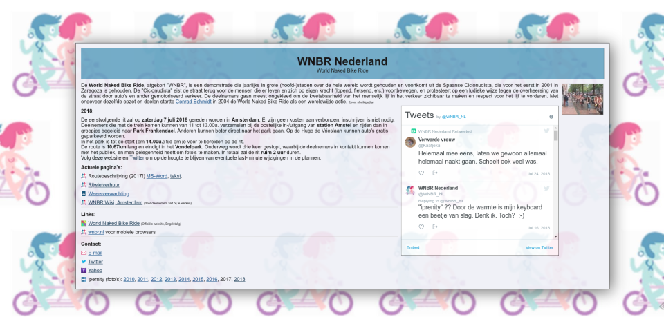
It’s not a bad website. It gives you the information you need, it doesn’t hurt your eyes, it even uses HTML5 and UTF-8 (so much better than my uni...). On the other hand there’s plenty one could do to make it better:
- it looks like from two decades ago, could use a new design (the design hasn’t been changed since the beginning of the website in 2011),
- it doesn’t use HTTPS, which is not understandable in the times of free and easy SSL certificates,
- the route is described in plain text (in a separate file!), even though it could easily (and conveniently for the visitors who don’t know the city) be a map,
- it uses an external website, Ipernity, as a photo galery – that website’s UX is horrible (it took me ages to simply upload some pictures), and its functionality could be easily integrated into the main website,
- it only provides a Dutch version, which is strange, since the event itself is pretty much English-speaking, with many international participants,
- it’s not responsive, instead offers a separate version for mobile.
And while it’s completely fine if a personal website or a side project looks like that, I feel really sad when I see a website of a doctor, a business, or a big event, that is so far away in the past... Plenty of people are working on constant improvements of the standards, on new technologies, new approaches, new APIs – and yet, as a user, I’m still left with not being able to make a doctor’s appointment online, as if it was so damn hard to implement... Spending your whole life on digitalising the world bit by bit, but not being able to fully enojoy that digitalisation as a user really sucks...
Anyways... As a person, who wants to make the world (also the cyber-world) a better place, who really enjoyed the WNBR this year and who happened to have some free time on my hands, I contacted the organisers and offered them my help in bringing their website to the 21st century.
I assumed they wouldn’t want it, actually. Somebody created the current website ( nsesoftware.nl), somebody is proud of it, and obviously nobody likes criticism... So I tried to be nice, not to criticise, but to offer some ideas and help.
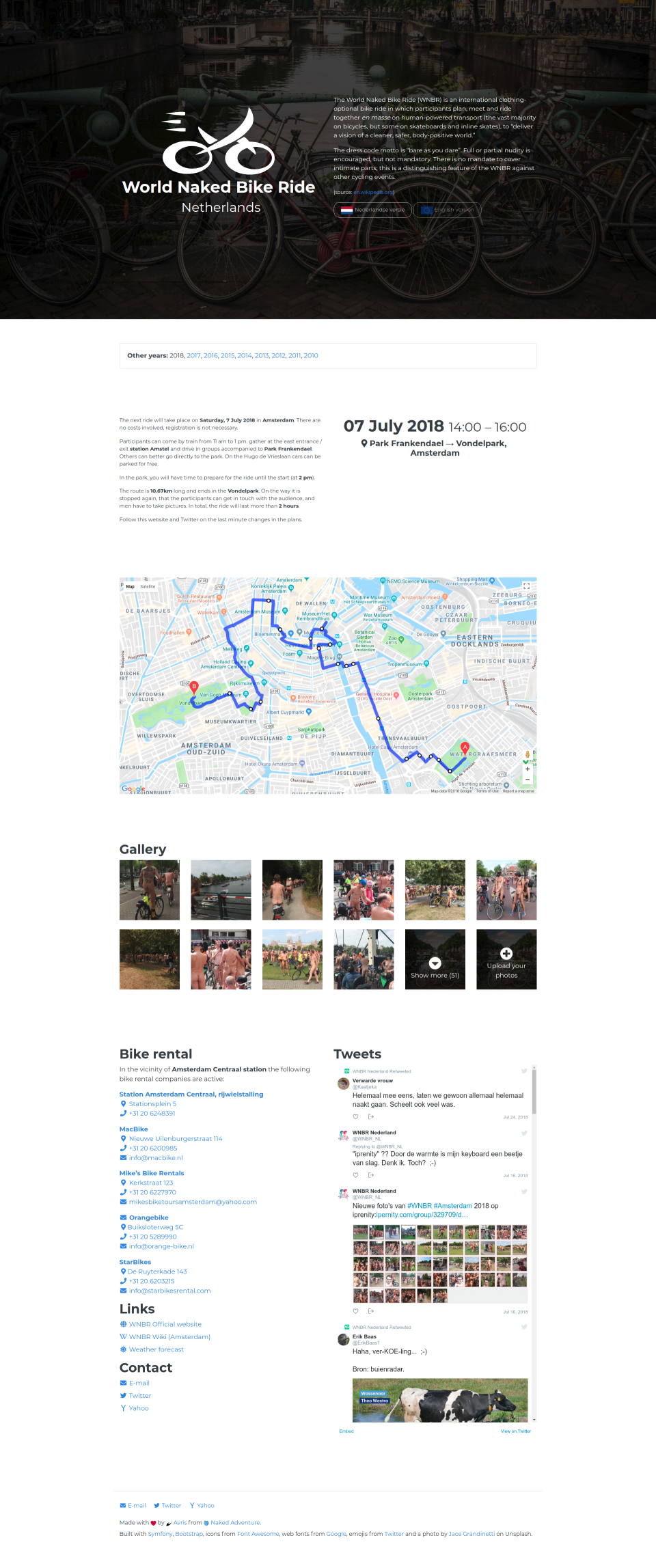
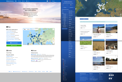
I got no answer though, and I really needed to start right away, as long as I had free time and the motivation to work on it. I ended up with something like this:
I got nothing but positive feedback from all the friends whom I’ve shown the end result. Still, I got no response from the WNBR people on wheather or not they actually want it. But since it’s almost done already, I’ve sent them a demo, saying that if they do, it’s free for them to use.
After a while I kind of got an answer – not a “no, thanks”, or even “fuck off”... instead, I just got blocked on Twitter. So childish... Well, that’s how you lose like a 1000€ worth of free service, too bad for them.
Anyways... a couple of days ago I stumbled upon the website polyamorynetwork.com. I totally fell in love with their logo 
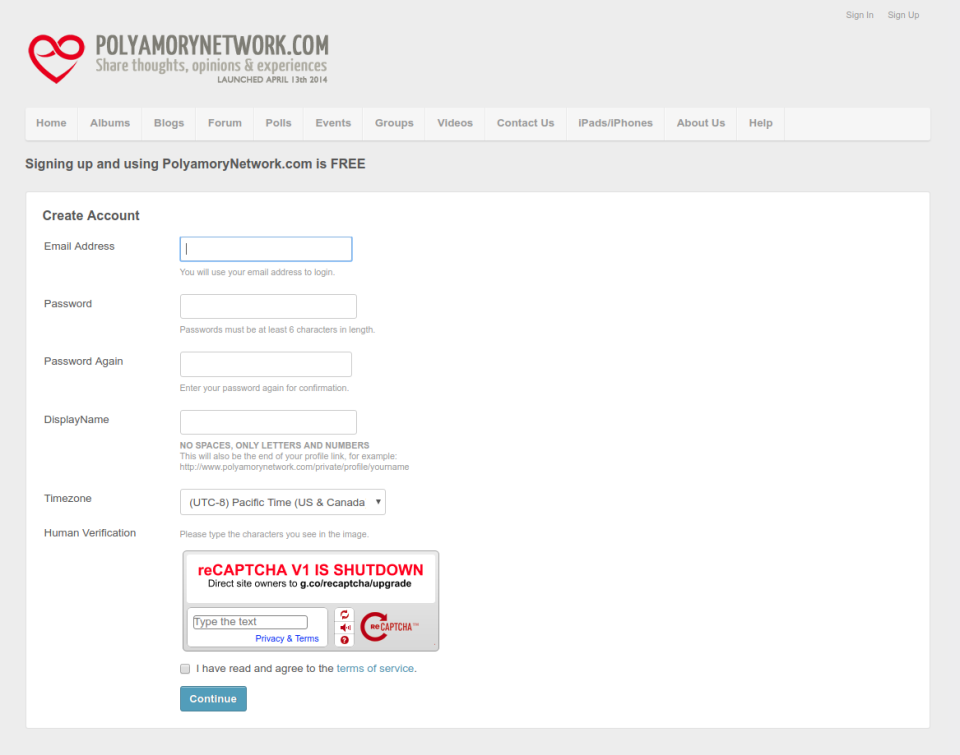
I couldn’t, though. Setting aside that the SSL certificate was expired since a month, which makes browsers give the user a scary red security warning... The registration form still uses reCAPTCHA v1, which got shutdown in March 2018 (and deprecated way earlier). That means nobody was able to join their network for the last half a year, and apparently nobody noticed!
Is the website abandoned? Why can’t it just say so? Or maybe there’s a big, active community there, but it’s closed for new members, because the admin doesn’t give a damn anymore? I guess I’ll never know.
Summing up
On one hand it’s great that anyone can build their own website – that’s what makes the web thrive, that’s what makes it open and equal!
On the other hand though – it requires way more skill and knowledge to do it right. If you want to look professional, keep that in mind.
So what’s my point? I guess I don’t have any, just wanted to complain a bit.
Except maybe for one thing:
Free website, anyone?
If you have (or want to start) a project, event or a non-profit organisation that I could stand behind (LGBTQ rights, human rights, naturism, non-monogamy, education...) that I could support from the IT side, feel free to contact me
 Avris
Avris
 Avris
Avris

