Redesigning a website: Avi

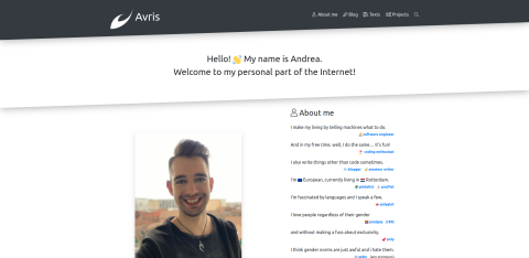
Yet another one of my projects, Avi • Simple placeholder avatars, grew too outdated to support it. I had to rewrite it from scratch.

I took the opportunity to redesign it as well.

It's quite a simple project, so it only took me a couple of hours. Here's what I did:

  • replaced my abandoned framework Micrus v4 • Beauty of simplicity with Symfony 5,
  • replaced custom Assetic setup with Webpack Encore,
  • updated Bootstrap from 3.0 to 4.4,
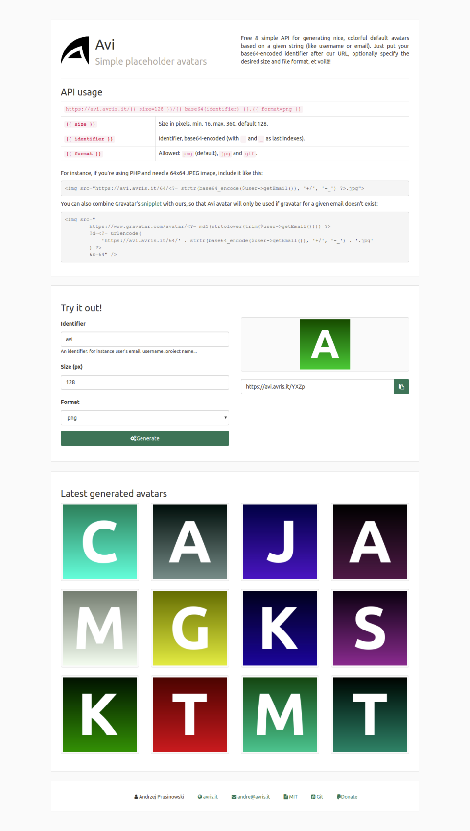
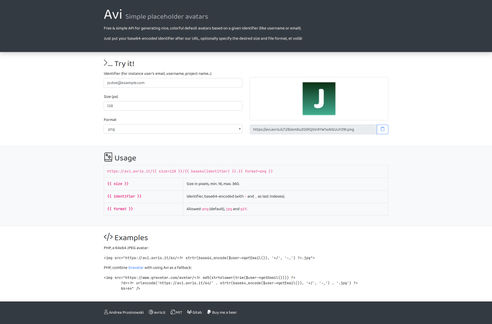
  • added more contrast to the design, while keeping it simple,
  • removed the ugly logo,
  • replaced the font that I used to overuse, Ubuntu, with the beautiful Baloo Thambi 2 and JetBrains Mono,
  • moved the generation of links from backend to frontend – now it gives you an immediate feedback to changes in the form, without having to reload the website,
  • removed the “Latest generated avatars” section – I never liked it, but I needed some showcase of what this project does… with the immediate feedback in the “Try it!” section, it's not needed anymore,
  • included some more optimisations.

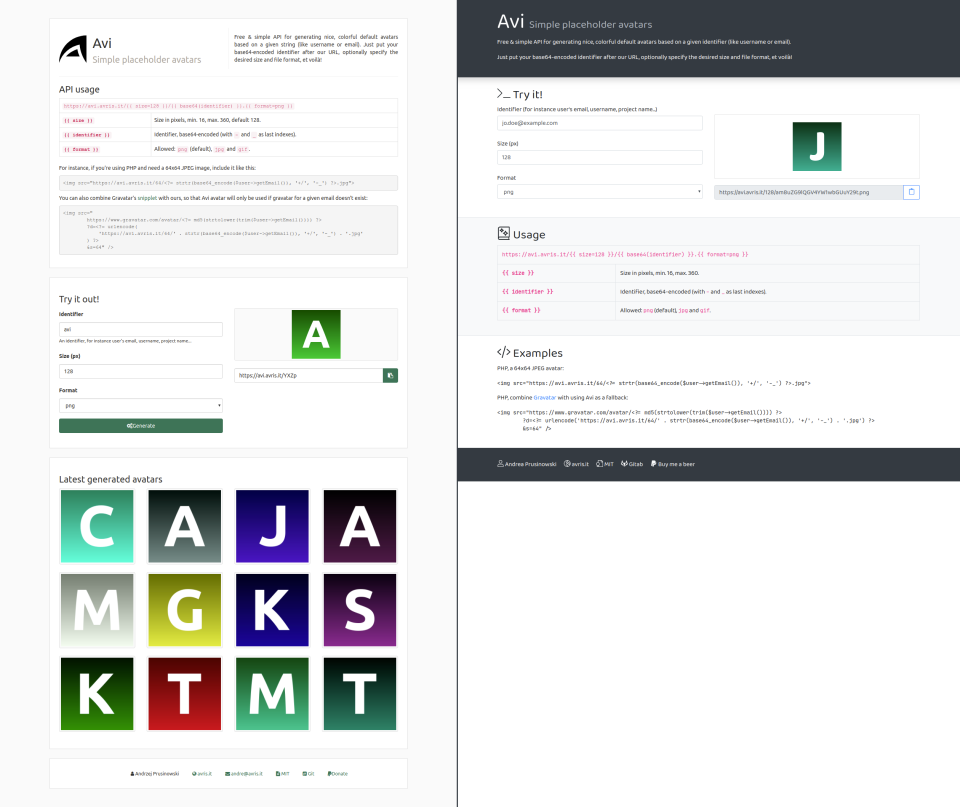
Before:

After:

A photo of me

About the author

Hi! I'm Andrea (they/them). I tell computers what to do, both for a living and for fun, I'm also into blogging, writing and photography. I'm trying to make the world just a little bit better: more inclusive, more rational and more just.

Related posts:

Finally. I got to work and rewrote the code of my sweet blog. Brand new design, new framework, Micrus, better support for language versions, a couple of new features in the admin panel, ditching custom comments for the awesomeness of Disqus, ditching TinyMCE for the beauty and simplicity of Markdown. It was a lot of work, but it was definitely worth it!

Hope you like it! :)

Wreszcie. Wziąłem się do roboty i przepisałem od zera kod mojego blogaska. Zupełnie nowy design, nowy framework, Micrus, lepsze wsparcie dla wersji językowych, parę nowych ficzerów w panelu administracyjnym, rzucenie własnego systemu komentarzy na rzecz zajebistości Disqusa, rzucenie TinyMCE dla piękna i prostoty Markdownu. Zajęło to sporo pracy, ale zdecydowanie było warto!

Mam nadzieję, że się spodoba! :)

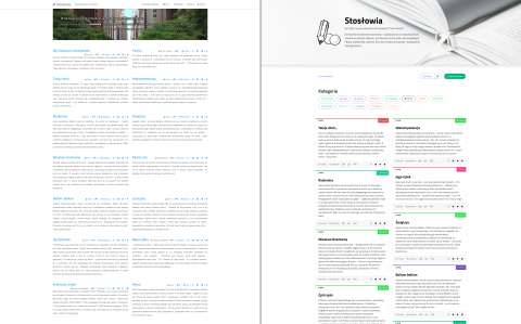
There is a website I’ve created many years ago, Stosłowia (Polish only), which collects stories of up to a hundred words. It never got any users, but I didn’t really care to promote it in any way either.

Last week I’ve decided to rewrite it from scratch, because so many things were wrong about it – from an ancient backend in plain PHP with hardcoded credentials and no separation of concerns, to login with Facebook (and only Facebook) that stopped working... Now it’s a fresh Symfony 4.1 with Encore with some new features (like automatic screenshot generation, seen for instance on Twitter).

But what I’d like to show you, is how a couple of pretty small design changes have made the whole website way nicer visually (IMHO).

Continue reading…
(~3 min read)
Screenshot of the new version of the blog

It wasn’t really supposed for the New Year, but I’ve had plenty of free time on my hands during the holiday break, so here it is already: a brand new version of my blog 🥳

Continue reading…
(~3 min read)

It’s honestly diffucult being a webdeveloper in the world of shitty websites. I guess that’s how hairdressers feel when they see my pathetic hair after it’s been a while since my last visit...

But the thing is, even though it’s technically easy to use scissors and clippers, I don’t do that on my own hair, I leave that to the professionals.

Continue reading…
(~5 min read)

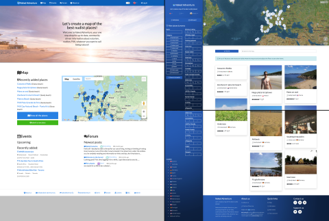
Yet another one of my projects, Naked Adventure, grew too outdated to support it. I had to rewrite it from scratch.

I took the opportunity to redesign it as well. (screenshots before & after at the bottom)

Continue reading…
(~2 min read)
naked-adventure.eu