I like multi-column design. Unfortunately, it’s really annoying to work with. If your tiles don’t all have the same height, it looks awful.
That’s why we have Masonry (and alternatives) – but they all use absolute positioning, which can be problematic for lazy loading of images, dynamically adding more elements, etc. We can try doing it with plain CSS – alas, it either breaks the order of tiles or requires knowing the height of the container in advance.
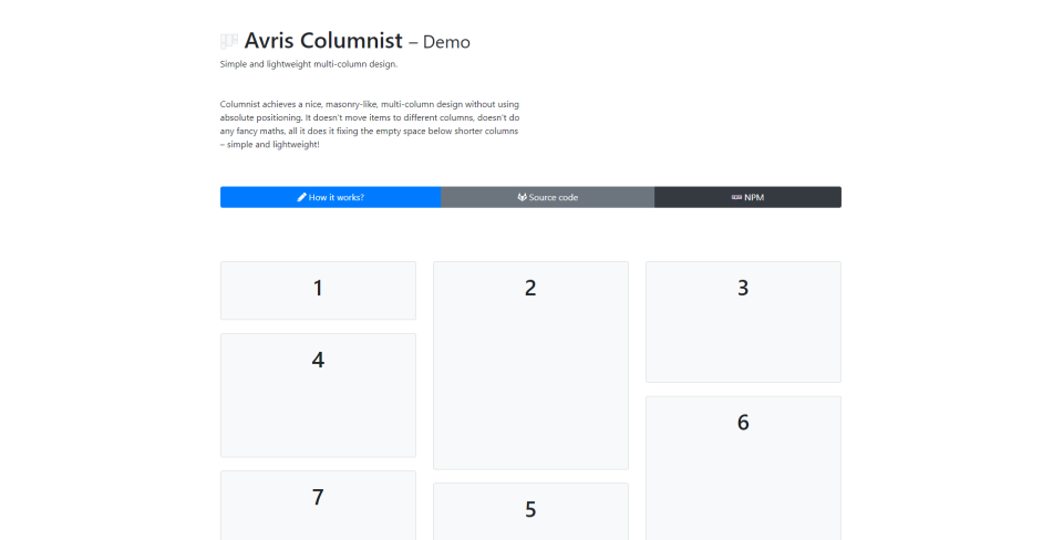
But I think I might have a solution to that: DEMO
Take a look at this graphic:

Our main job is to make the empty space marked with the red arrow disappear. If we can calculate its height, we can give the tile right below it a negative margin-top to compensate for the height of the empty space.
And we can! All we need is to make sure that the column only has one child element. The difference between the height of the column and of that child is what we need to compensate for.
We can find the tile right below from it (i + numberOfColumns), give it margin-top: -${diff}px et voilà!
Limitations
My script does not do any maths fancier than this. If your first column contains a very tall tile A and a small tile B, and your second column only contains a small tile C, it would look nicer, if B were moved to the second column. My script doesn’t do that. That’s the price of simplicity.
Future work
Current implementation relies a setInterval that reapplies the layout every 300 ms. Firstly, because a couple of iterations are needed to get the final layout, and secondly, because the DOM and window can change.
Obviously, I can get rid of both those problems. Applying the layout in a loop or in some smarter way, adding event listeners, etc.
But that’s a job for the next free evening / weekend.
Anyways, check out the links below and enjoy 😉