🇬🇧 Columnist – Simple and lightweight multi-column design

I like multi-column design. Unfortunately, it’s really annoying to work with. If your tiles don’t all have the same height, it looks awful.
That’s why we have Masonry (and alternatives) – but they all use absolute positioning, which can be problematic for lazy loading of images, dynamically adding more elements, etc. We can try doing it with plain CSS – alas, it either breaks the order of tiles or requires knowing the height of the container in advance.
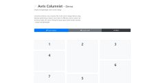
But I think I might have a solution to that: DEMO
Continue reading… (~2 min read)