 Avris
Avris
 Avris
Avris

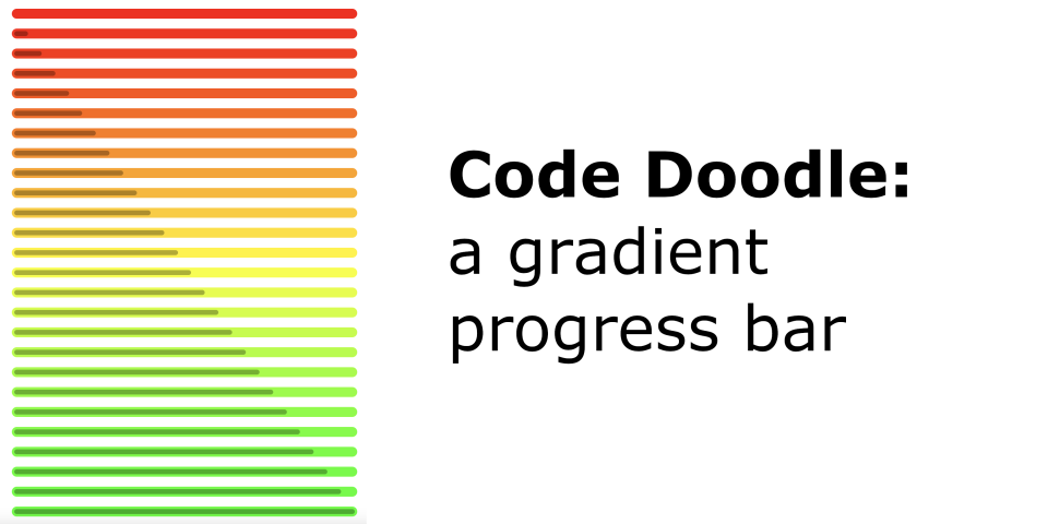
A simple doodling project – probably not that useful, but I enjoyed creating it 
I liked the way Wendover Productions displayed the HDI score in their video
„The News You Missed in 2021”,
so of course I decided to create a widget like this for VueJS 
Here's a demo:
And here's how I made it:
To minimise the initial bootsrapping, I picked a framework I already know and absolutely love: Nuxt. Its upcoming version, v3, cuts all the bootstrapping crap to the minimum, while remaining highly flexible. All I had to do to start working were those commands:
npx nuxi init ProgressBar
cd ProgressBar
yarn
yarn dev -o
What they do is fetch a project template, install dependencies, start a development server
and open http://localhost:3000/ in the browser.
Bootrapping done; now I can focus on work. It's a simple project, so only two files will be relevant:
app.vueis the main entrypoint, the homepage. It contains what you see in the demo: just some introduction and lots of<AvrisProgressBar/>components embedded to showcase their usage. I won't focus here on theapp.vuecode, because it's really straightforward – you can check it out here. Sidenote: if I ever need to add multiple pages, I'll just create aroutesdirectory and moveapp.vueto the appropriate structure inside of that folder, it's as simple as that! – and for the simplest case it's all already preconfigured and working!components/AvrisProgressBar.vueis the actual component I'll be working on. Nuxt automatically configures everything so that throughout the application you can simply use the<AvrisProgressBar/>tag.
The template is really simple:
<template>
    <div class="outer" :style="`background-color: ${colourOuter}`">
        <div class="inner" :style="`width: ${percent}%; background-color: ${colourInner}`"
             role="progressbar" :aria-valuenow="percent" aria-valuemin="0" aria-valuemax="100"></div>
    </div>
</template>
All we need is two divs:
- the outer one, taking a full width of the container and coloured with the „main” colour depending on the value of the progress bar,
- the inner one, taking a fraction of the outer div's width proportional to the progress bar's value and coloured with a shade slightly darker than the „main” colour.
And here's how I styled them:
<style scoped>
.outer {
    --apb-height: 16px;
    --apb-border-width: 0px;
    --apb-border-color: #aaa;
}

.outer {
    width: 100%;
    border-radius: calc(var(--apb-height) / 2);
    height: var(--apb-height);
    margin: 4px;
    padding: calc(var(--apb-height) / 4 - var(--apb-border-width));
    display: inline-block;
    border: var(--apb-border-width) solid var(--apb-border-color);
}
.outer .inner {
    height: calc(var(--apb-height) / 2);
    border-radius: calc(var(--apb-height) / 2);
}
</style>
I used CSS variables so that each usage of this widget can override the default height and border.
Now all we need to do is calculate percent, colourOuter and colourInner. Easy!
Let's start with declaring props of our component:
<script>
export default {
    props: {
        value: { required: true },
        min: { 'default': 0 },
        max: { 'default': 1000 },
        colours: { 'default': () => {
            return [
                '#ff0000',
                '#ffff00',
                '#00ff00',
            ];
        }}
    },
};
</script>
We expect the user of our widget to provide a value (eg. <AvrisProgressBar :value="123"/>)
and we allow them to overwrite the default values of min (0), max (1000) and colours (red, yellow, green)
with their own (eg. <AvrisProgressBar :value="69" :min="24" :max="169"/>).
Now let's calculate the percent.
It's pretty simple: we divide the current progress by the full range, and multiply by 100%.
If min == 0, the formula is trivial: 100% * value / max.
But in any other case we should add the min to the formula:
100% * (value - min) / (max - min).
Plus let's cut it at no less than 0 and no more than 100, just in case the user provides some weird input.
Here's a Vue code that implements that:
computed: {
    percent() {
        let percent = 100 * (this.value - this.min) / (this.range);
        if (percent < 0) { return 0; }
        if (percent > 100) { return 100; }
        return percent;
    },
    range() {
        return this.max - this.min;
    },
},
And for the remaining two properties that we need, let's first mock their values to simply be green and black respectively,
just so that we can validate that percent works well without worrying about the colours.
computed: {
    colourOuter() {
        return '#00ff00';
    },
    colourInner() {
        return '#000000';
    },
},
Of course, in a full-blown, production-ready library, we should cover a lot more ground than in my simple doodle: supporting multiple colour models, implementing colour mixing algorythms that adjust for human perception, etc. But here I wanted to keep it simple:
- we only support RGB,
- we only support the HTML colour syntax with six digits (eg.
#C71585), - we darken the colour by simply decreesing all of its RGB components by the same percent,
- we mix the colours to create the gradient by simply calculating a weighted average for each RGB component.
Actually, that's my main purpose for creating this widget – I'm curious whether such a simple setup would give a visually pleasant effect. Spoiler alert: it's not perfect, but it works well enough indeed!
So now, let's compute two more values that will help us in further calculations.
coloursHighpoints will be a map between the primary colours and the values where they should appear.
In the default case, we have n = 3 colours (red, yellow, green) and a range from 0 to 1000,
so to spread them out evenly we'd need red to be at 0, yellow at 500 and green at 1000.
The code below splits the available range into n - 1 sections (so in this case sections have a width of 500)
and then produces points at: min, min + range, min + 2*range, …
So in our case the methods retuns a map like this: {0: "#ff0000", 500: "#ffff00", 1000: "#00ff00"}:
coloursHighpoints() {
    const highpoints = {};
    const sectionRange = this.range / (this.colours.length - 1);
    for (let i in this.colours) {
        const point = parseInt(this.min + i * sectionRange, 10);
        highpoints[point] = this.colours[i];
    }
    return highpoints;
},
The next step would be to figure out which colours to mix for a given value.
Let's say our value = 400. We know it's between 0 / red and 500 / yellow,
so we expect it be an orange-ish yellow.
But how do we put that into code?
We need a method that will return an object telling us what's the closest highpoint
before our value, and what's the closest one after our value.
Let's iterate over the highpoints and keep assigning their values to the variable left as long as it's smaller than this.value.
As soon as a highpoint appears that's higher than this.value, we assign it to the right variable.
And then let's handle the edge case of value >= max.
Here's the code for that, and it produces the following output for our parameters: {left: 0, right: 500}.
coloursBetween() {
    let left = null;
    let right = null;
    for (let val of Object.keys(this.coloursHighpoints)) {
        val = parseInt(val);
        if (val <= this.value) {
            left = val;
            continue;
        }
        right = val;
        break;
    }
    if (!right) {
        right = left;
    }
    return {left, right};
},
Before we actually calculate our colours, let's prepare some helpers that we'll need:
hexToDecanddecToHex– simply converting the number base and adding some hex-colour specific padding,splitColour: turns#C71585into[199, 21, 133],mergeColour: turns[199, 21, 133]into#C71585,adjustValue: takes an RGB component and increases it by a givenpercent,shadeColour: splits a colour into components, adjusts their value and merges them back into a colour,mixColours: takes two colours and a ratio in which they should be mixed, splits them into components, for each of them calculates a weighted average, and then merges them back into a colour.
methods: {
    hexToDec(hex) {
        return parseInt(hex, 16);
    },
    decToHex(dec) {
        return parseInt(dec, 10).toString(16).padStart(2, '0');
    },
    splitColour(colour) {
        return [
            this.hexToDec(colour.substring(1, 3)),
            this.hexToDec(colour.substring(3, 5)),
            this.hexToDec(colour.substring(5, 7)),
        ];
    },
    mergeColour(r, g, b) {
        return `#${this.decToHex(r)}${this.decToHex(g)}${this.decToHex(b)}`;
    },
    adjustValue(val, percent) {
        val = parseInt(val * (100 + percent) / 100);
        if (val > 255) { val = 255; }
        if (val < 0) { val = 0; }
        return val;
    },
    shadeColour(colour, percent) {
        const [r, g, b] = this.splitColour(colour);

        return this.mergeColour(
            this.adjustValue(r, percent),
            this.adjustValue(g, percent),
            this.adjustValue(b, percent),
        );
    },
    mixColours(colour1, colour2, ratio) {
        const [r1, g1, b1] = this.splitColour(colour1);
        const [r2, g2, b2] = this.splitColour(colour2);

        return this.mergeColour(
            r1 * ratio + r2 * (1 - ratio),
            g1 * ratio + g2 * (1 - ratio),
            b1 * ratio + b2 * (1 - ratio),
        );
    },
},
And now it's finally time to put it all together.
To calculate colourOuter we take the coloursBetween and we calculate
how far away from left is our value.
In our case that's (value - left) / (right - left) = (400 - 0) / (500 - 0) = 400 / 500 = 0.8.
We will use that value as our weight when calculating the weighted average
between the colour in the left highpoint and the colour in the right highpoint.
And colourInner will just be just colourOuter darkened by 30%.
colourOuter() {
    const {left, right} = this.coloursBetween;
    const ratio = (this.value - left) / ((right - left) || 1);

    return this.mixColours(
        this.coloursHighpoints[left],
        this.coloursHighpoints[right],
        1 - ratio,
    );
},
colourInner() {
    return this.shadeColour(this.colourOuter, -30);
},
And that's it, we're done!