There is a website I’ve created many years ago, Stosłowia (Polish only), which collects stories of up to a hundred words. It never got any users, but I didn’t really care to promote it in any way either.
Last week I’ve decided to rewrite it from scratch, because so many things were wrong about it – from an ancient backend in plain PHP with hardcoded credentials and no separation of concerns, to login with Facebook (and only Facebook) that stopped working... Now it’s a fresh Symfony 4.1 with Encore with some new features (like automatic screenshot generation, seen for instance on Twitter).
But what I’d like to show you, is how a couple of pretty small design changes have made the whole website way nicer visually (IMHO).
Logo
Let’s start with the logo. The old one was the laziest option possible: just an icon of a pencil from Font Awesome v4.
The new one is a modification of free vector icons created by Denis Sazhin from the Noun Project (CC-BY), that looks way more individual. Its elements form a “100”, which relates to the name and the purpose of the website.
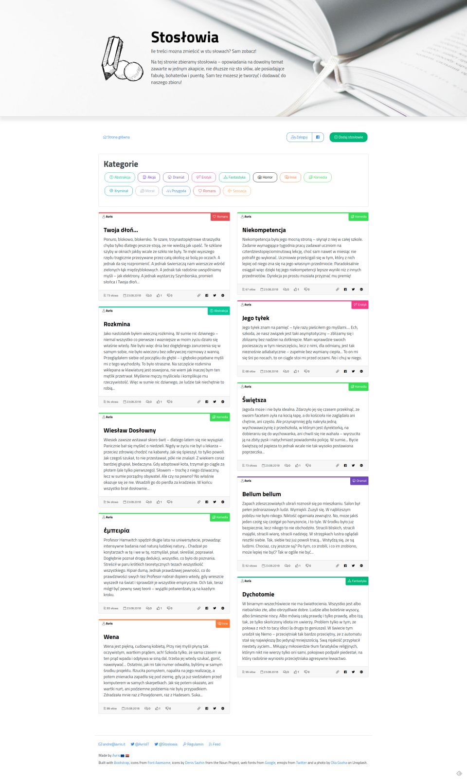
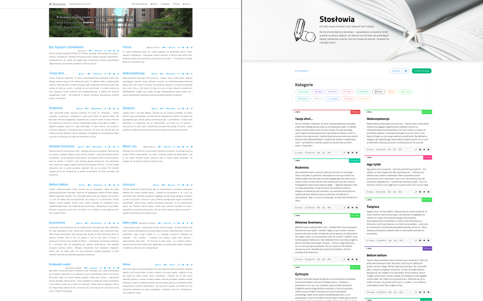
Old design
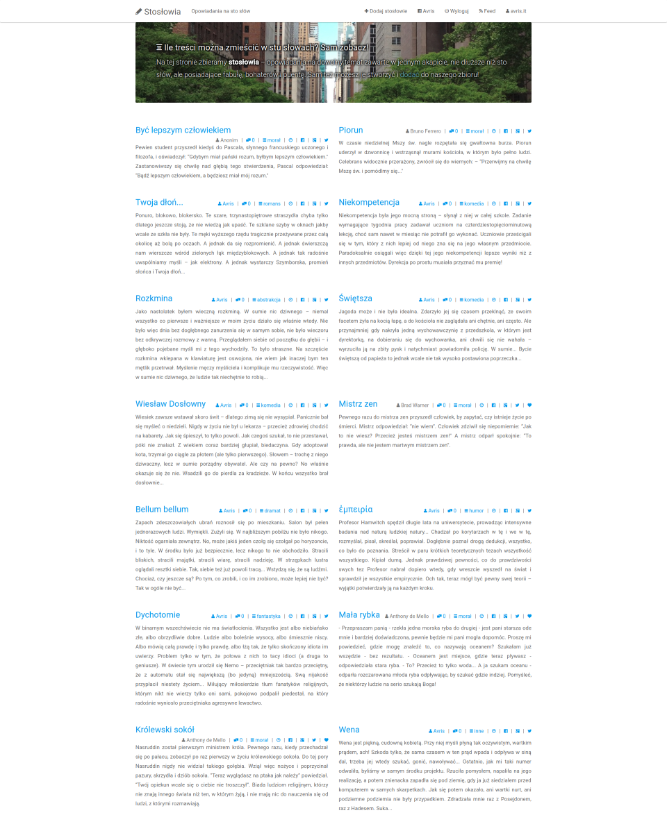
Maybe I shouldn’t judge the design, if it’s me who created the website, but since it’s mostly a Bootswatch theme anyway, I’ll dare to say: it’s not bad. I like it. It’s clean and minimalist.
What I don’t like is my own choices: like the jumbotron with random background images, which made the text not-so-readable, even with the addition of a text shadow, or the lack of a footer, which makes the website look somehow... incomplete...
So what I did to polish it up:
- I rebuilt it in Bootstrap 4 using a different Bootswatch theme (slightly modified).
- I switched the Font Awesome icons to version 5, the light version.
- I switched the font to something more distinctive.
- Made the jumbotron bigger, with a non-random background image that matches the subject matter and is subdued, so that the text is better visible.
- Even though the random jumbotrons in the old website were meant to add some colour to an otherwise dull website, it still looked pretty monotonous. That’s why I decided to assign colours to the categories and display them as small bars on top of the story-card.
- Also to break the monotony, I decided to align the cards in a Masonry manner, instead of just rows.
- Within the card, I separated the important info (title, author, category) on the top, from the less important (number of words, date of submission, comments, votes and social buttons) on the bottom.
- Categories are pretty important, yet in the old design they weren’t emphasised at all. With the addition of colours they are way more visible, yet to make them even more distinctive and useful, I added icons and a list of all categories on the top.
- I added a footer.
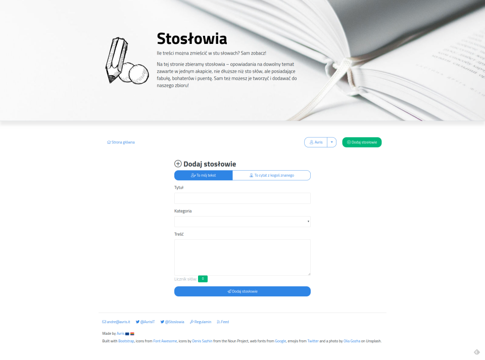
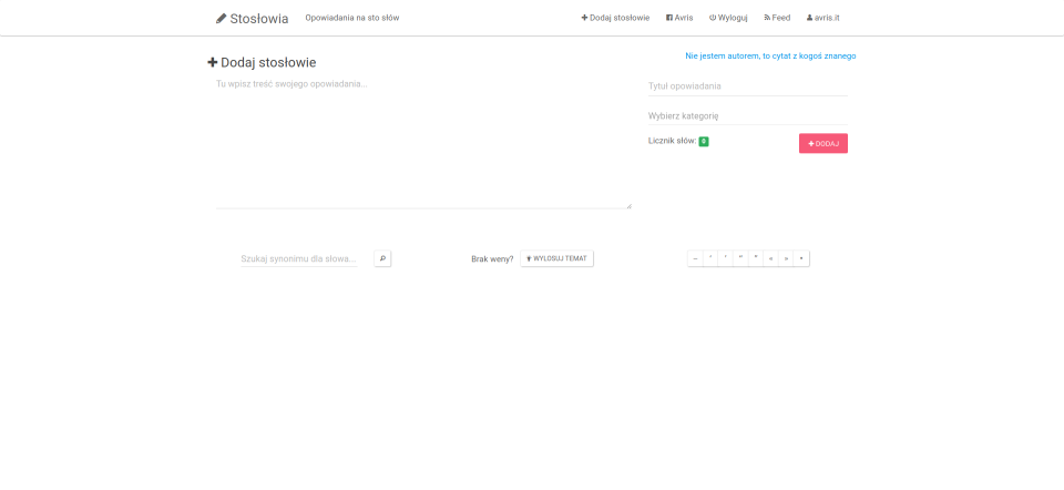
- I reorganised the submission form so that it has a simple up-to-down flow, instead of the previous two columns that made it easy to overlook some fields.
Check out the end effect below. What do you think? 😉
New design