Avris » Tag: bootstrapHello! My name is Andrea. I code and write a blog. Welcome to my personal part of the Internet!https://avris.it/tag/bootstrap.atom2020-05-23T20:45:46+00:00AvrisRedesigning a website: Naked Adventureurn:uuid:0962ed0b-cc53-5f2a-b898-5f1322ad0bd52020-05-23T20:45:46+00:00
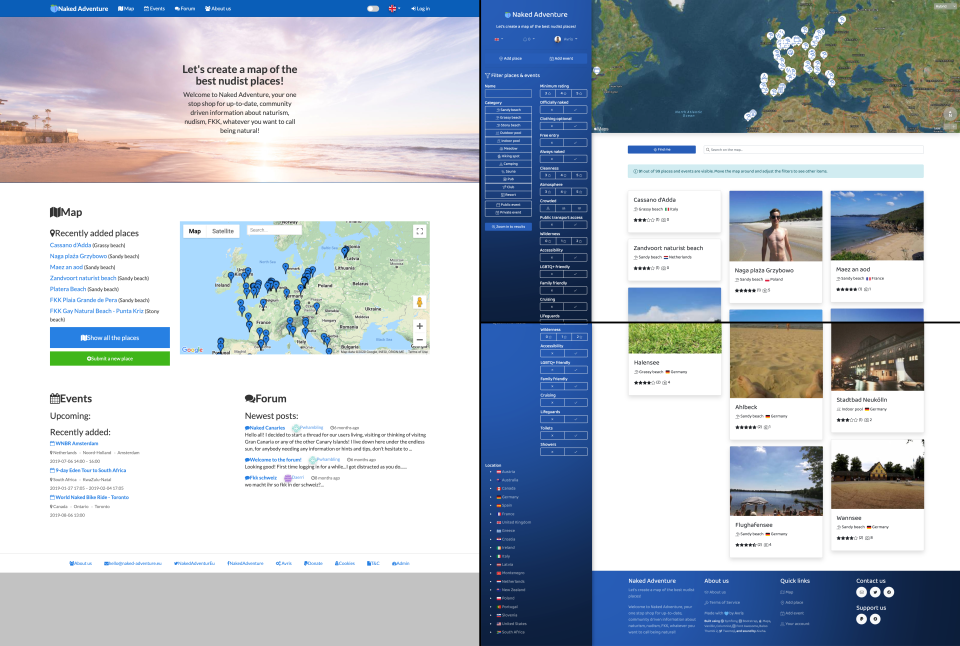
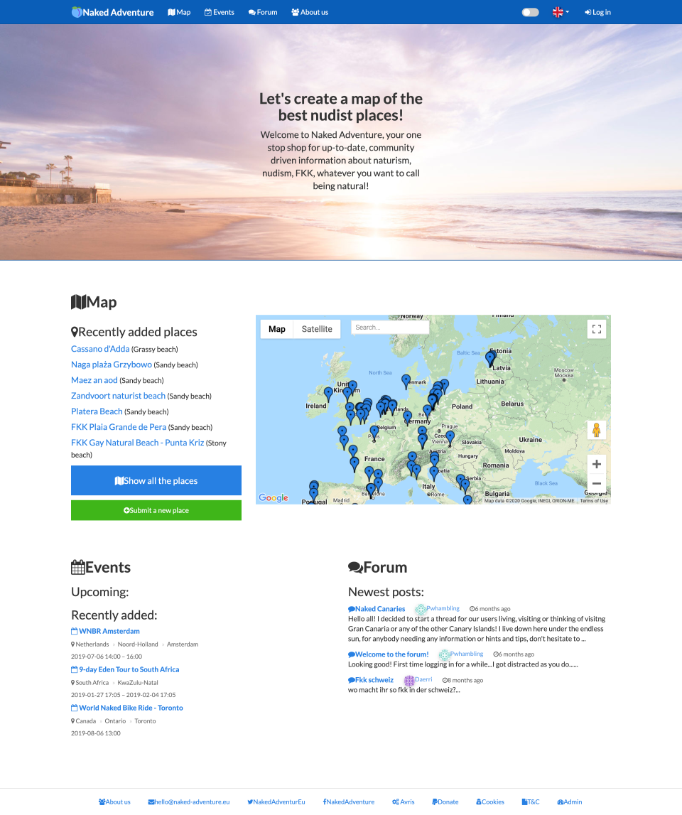
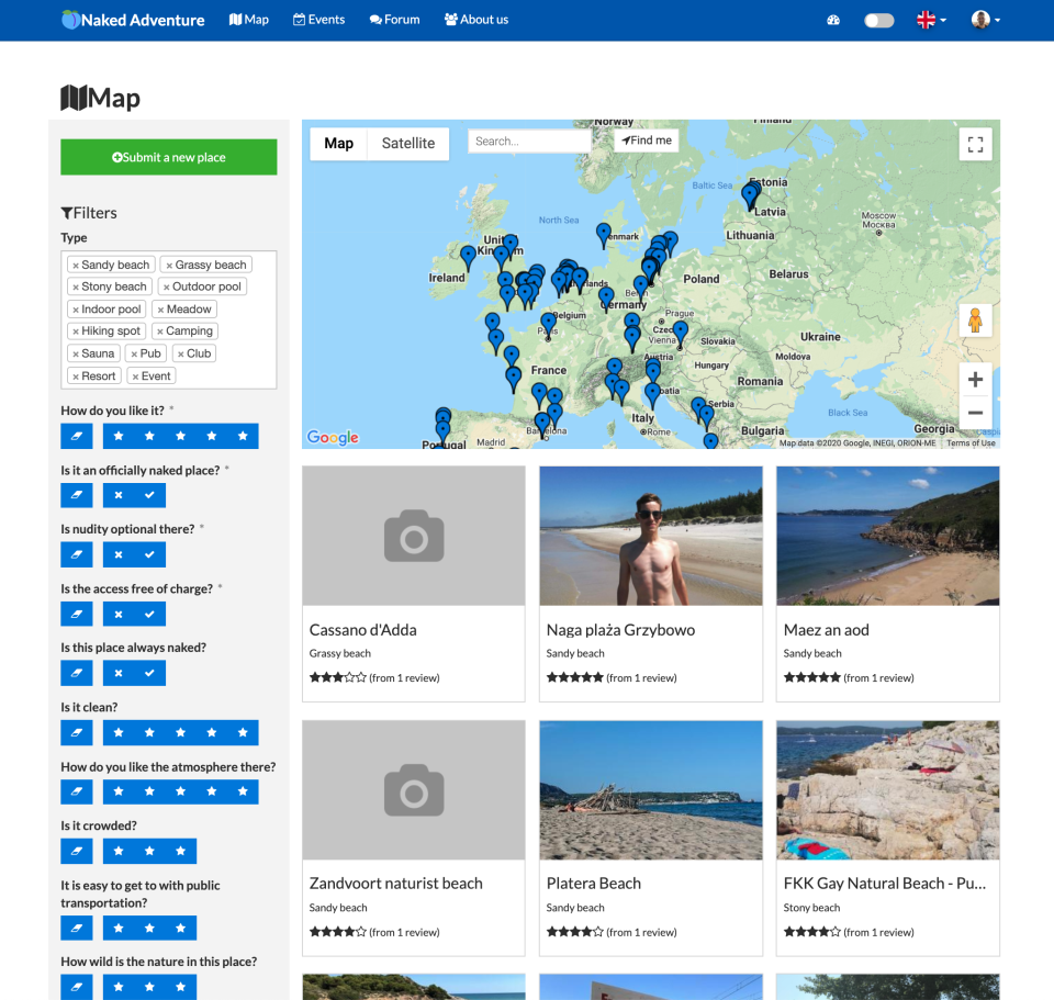
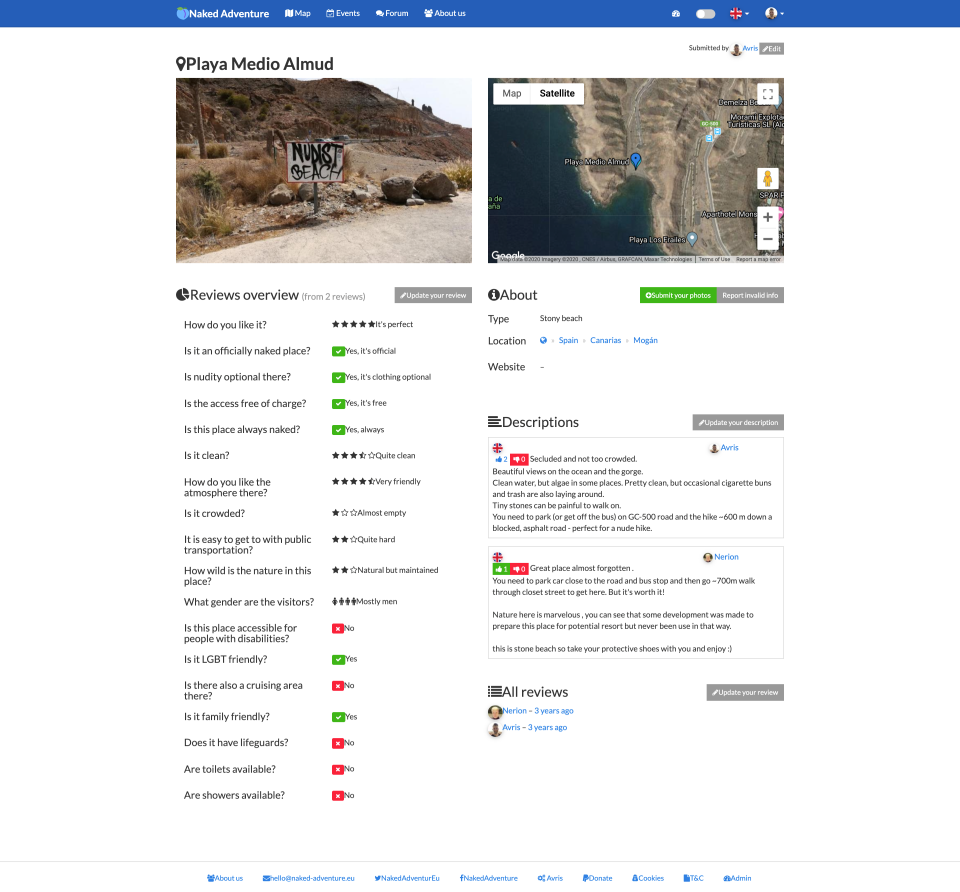
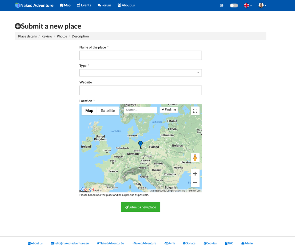
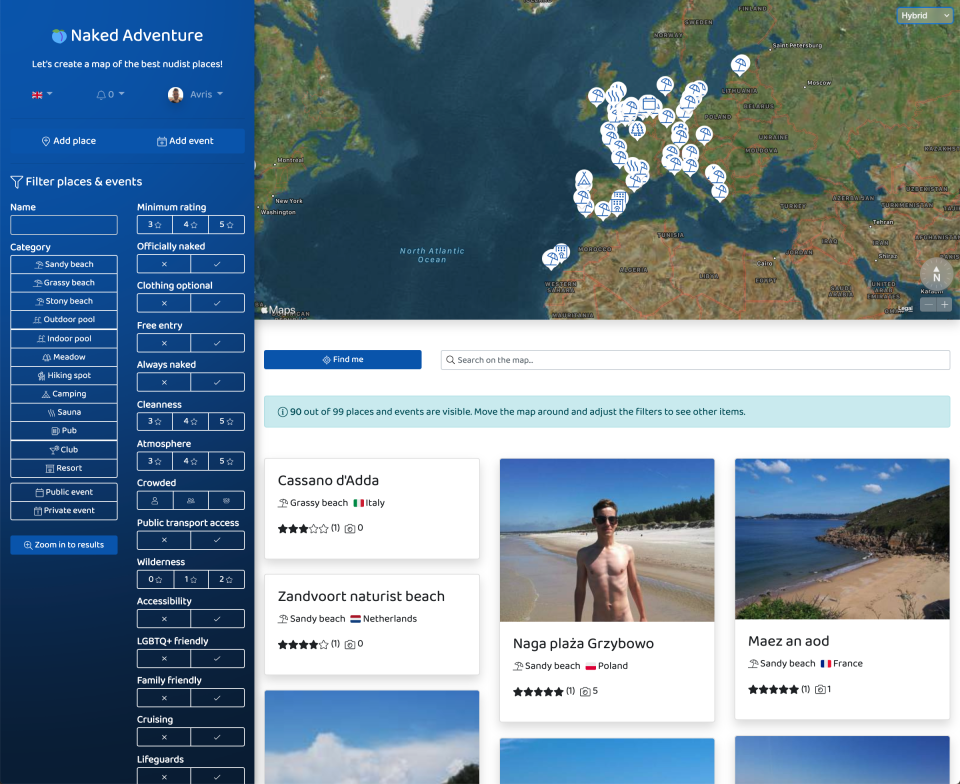
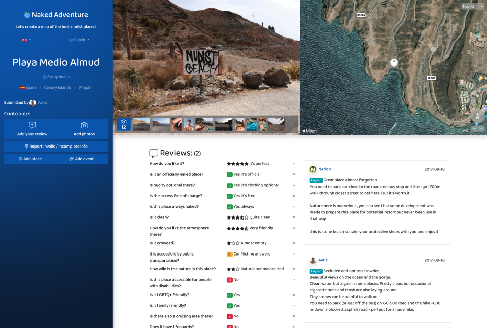
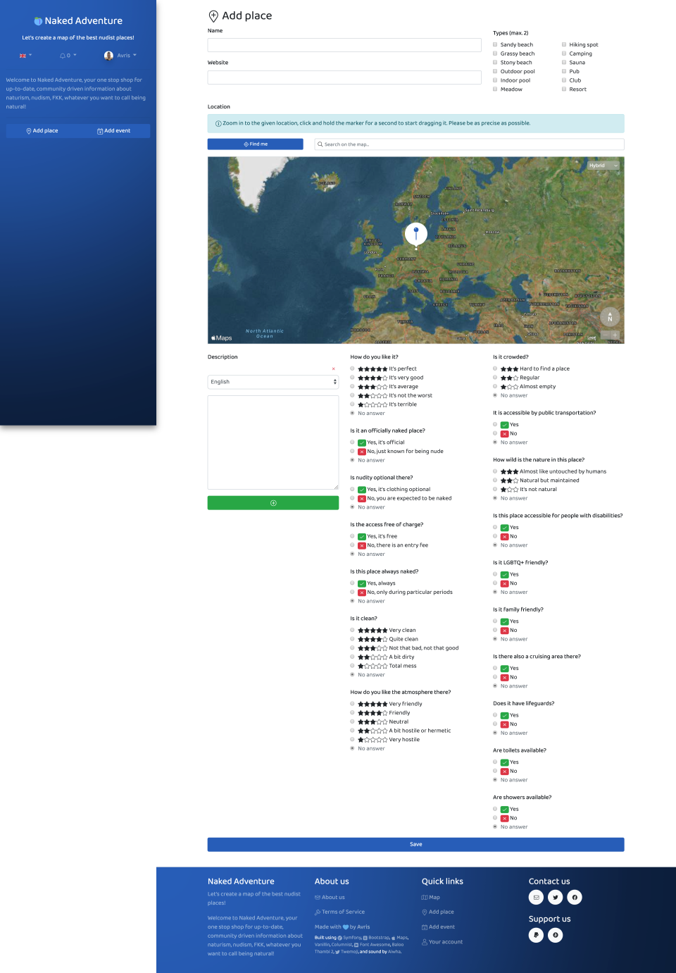
Yet another one of my projects, Naked Adventure,
grew too outdated to support it. I had to rewrite it from scratch.
I took the opportunity to redesign it as well. (screenshots before & after at the bottom)
]]>
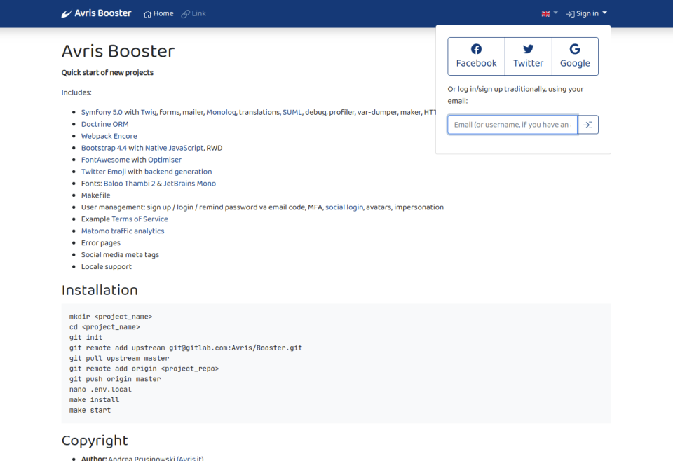
Avris Booster: Quick start of new projectsurn:uuid:b3b07017-6ecd-5869-9f1b-138ba0bcafb22020-04-13T09:56:14+00:00
I got super annoyed having to set up all the dependencies for each project every time I started one,
and especially implementing user management... Log in, register, confirm email, forgot password,
MFA, change email, impersonate, manage avatars, over and over again, booooooring!
So here it is: a template for quickstarting new projects,
with all of the above (and more!) included out of the box!
]]>
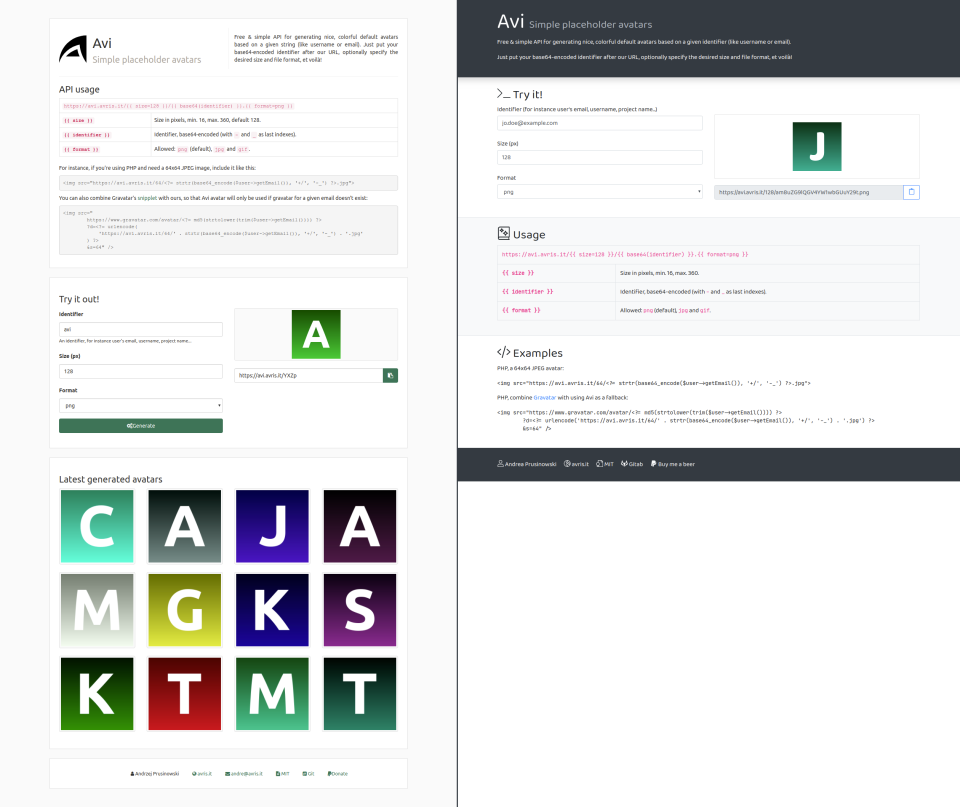
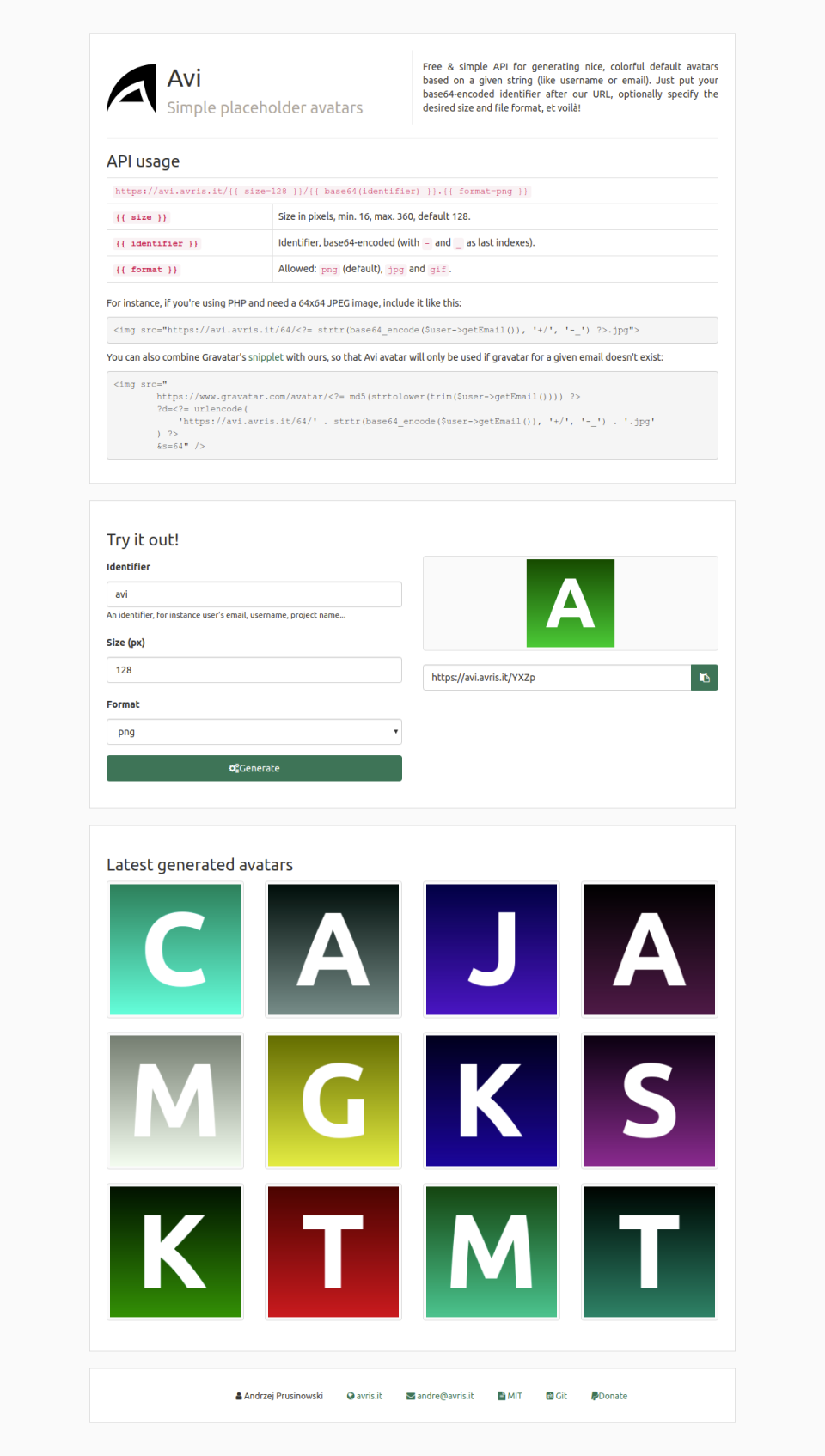
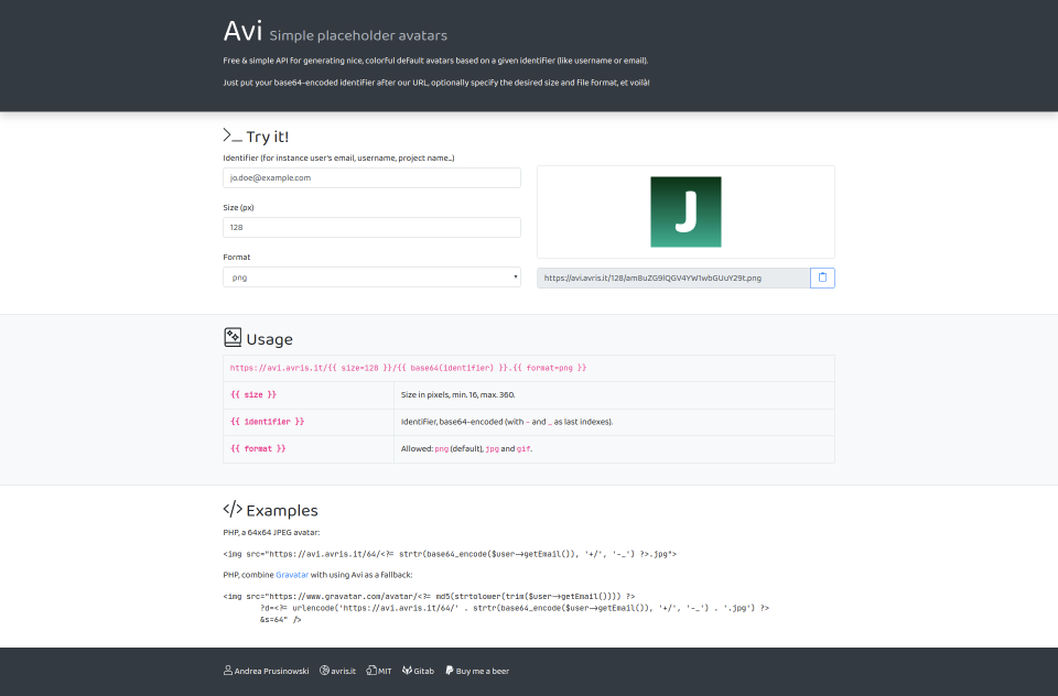
Redesigning a website: Aviurn:uuid:494c6d0e-88de-5157-8523-72461ab63f552020-04-10T17:33:59+00:00
Yet another one of my projects, Avi • Simple placeholder avatars,
grew too outdated to support it. I had to rewrite it from scratch.
I took the opportunity to redesign it as well.
It's quite a simple project, so it only took me a couple of hours. Here's what I did:
moved the generation of links from backend to frontend – now it gives you an immediate feedback
to changes in the form, without having to reload the website,
removed the “Latest generated avatars” section – I never liked it, but I needed some showcase
of what this project does… with the immediate feedback in the “Try it!” section, it's not needed anymore,
]]>
Reducing website size by a half by optimising Bootstrap and FontAwesomeurn:uuid:6fa056af-bd1b-5693-96a8-7f6d1ea7caed2020-01-10T10:53:15+00:00
My new blog, despite being simple and freshly rewritten, loads way too much crap...
So I took a few moments to optimise it a bit – and I ended up with almost 50% reduction in resources size
in just two steps!
Bootstrap
Bootstrap is awesome. But it’s also a lot.
Modals? Popovers? Tooltips? Badges? Toasts? I don’t use any of that!
I already don’t include any of Bootstrap’s JavaScripts, but I should definitely clean up its CSS.
So instead of including
@import "~bootstrap"
I went to its source and copy-pasted the modules that it was loading over there,
commenting out the ones I don’t need:
The only issue is that I do use forms.scssa bit.
There is a search form in the header that has its <input> field styled.
So I just inspected that element in Opera and pretty much just copy-pasted the three relevant selectors.
Bum! Starting off with a minified CSS file of 244 KB, now it’s down to 184 KB.
A third of its weight is now gone.
But that’s just the first step.
FontAwesome
The real big deal in terms of the website weight were the FontAwesome icons.
There’s thousands of icons included, but I only use a dozen – so why do I make visitors download them all?
You can load FontAwesome in a number of different ways. One of them are SVG sprites.
You can include the definitions of the icons in a form of SVG <symbols>s, and whenever they’re used,
just use a <use> tag to reference it.
So a wrote a simple service (plus a Twig extension) that would do exactly that:
put <use> tags wherever an icon should be displayed,
keep track of the icons used,
dump the definions of the used icons at the bottom of the page.
I just had to add some CSS to display the SVG icons the same way as webfonts
in terms of size, position and using the color of the surrounding text:
Et voilà!
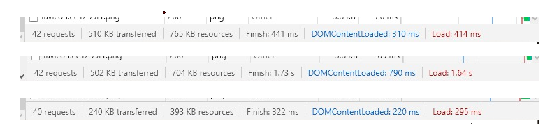
The homepage of my blog went down from 765 KB at the beginning,
to 704 KB after the first step, to 393 KB now!
Btw, I’ve put my little helper into a library,
if you want to check it out.
There’s caveats though...
SVG is heavy. The two .woff2 files I was using are 261 KB overall,
while the corresponding two sprites are 2.1 MB.
But if I filter their content to just the icons I actually use (which is way simpler to do in SVG than in webfonts),
it goes down to just 44 KB!
So if your website is using a looot of fonts, you’ll probably be better of generating a custom webfont.
There can also be issues related to warm caches possibly circumventing the Optimiser,
with data that includes new icons being loaded dynamically in JS (which I don’t do),
with the increased execution time (which doesn’t bother me since I use an HTTP cache),
etc. Still, in many cases this trick can be very useful. Like mine.
Switching from webfonts to dynamically filtered SVG sprites
not only removed the need for two requests .woff2 files,
but also the need for the CSS that maps class names to font glyphs.
My CSS file went down again, from 184 KB to just 96 KB.
Summing up
So here I am: having spent not even a full evening on it, doing optimisations as simple as they can get,
and ending up with the website trimmed of half of its fat.
Nice 😎
]]>
Redesigning a website: Stosłowiaurn:uuid:4cb83ad3-6f44-5628-868b-77c140aa79742018-08-24T13:22:00+00:00
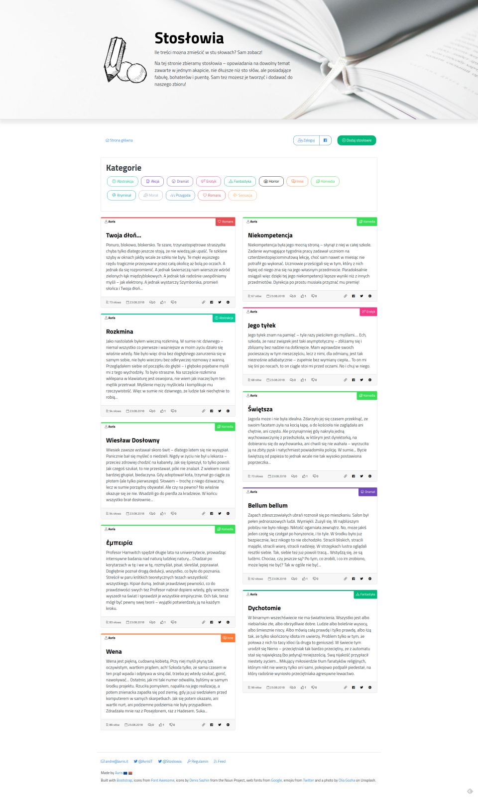
There is a website I’ve created many years ago, Stosłowia (Polish only), which collects stories of up to a hundred words. It never got any users, but I didn’t really care to promote it in any way either.
Last week I’ve decided to rewrite it from scratch, because so many things were wrong about it – from an ancient backend in plain PHP with hardcoded credentials and no separation of concerns, to login with Facebook (and only Facebook) that stopped working... Now it’s a fresh Symfony 4.1 with Encore with some new features (like automatic screenshot generation, seen for instance on Twitter).
But what I’d like to show you, is how a couple of pretty small design changes have made the whole website way nicer visually (IMHO).
Logo
Let’s start with the logo. The old one was the laziest option possible: just an icon of a pencil from Font Awesome v4.
The new one is a modification of free vector icons created by Denis Sazhin from the Noun Project (CC-BY), that looks way more individual. Its elements form a “100”, which relates to the name and the purpose of the website.
Old design
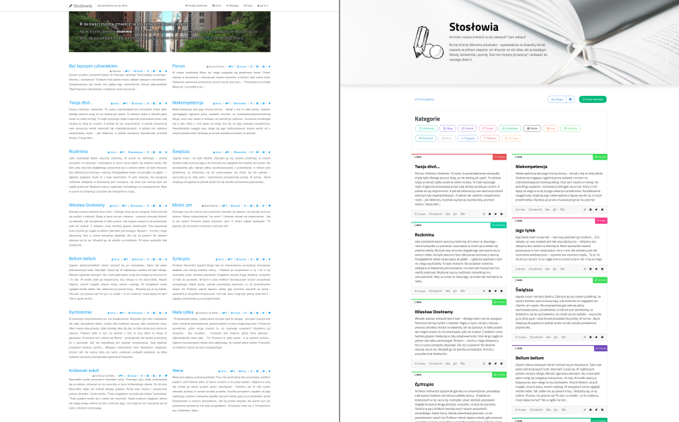
Maybe I shouldn’t judge the design, if it’s me who created the website, but since it’s mostly a Bootswatch theme anyway, I’ll dare to say: it’s not bad. I like it. It’s clean and minimalist.
What I don’t like is my own choices: like the jumbotron with random background images, which made the text not-so-readable, even with the addition of a text shadow, or the lack of a footer, which makes the website look somehow... incomplete...
I switched the Font Awesome icons to version 5, the light version.
I switched the font to something more distinctive.
Made the jumbotron bigger, with a non-random background image that matches the subject matter and is subdued, so that the text is better visible.
Even though the random jumbotrons in the old website were meant to add some colour to an otherwise dull website, it still looked pretty monotonous. That’s why I decided to assign colours to the categories and display them as small bars on top of the story-card.
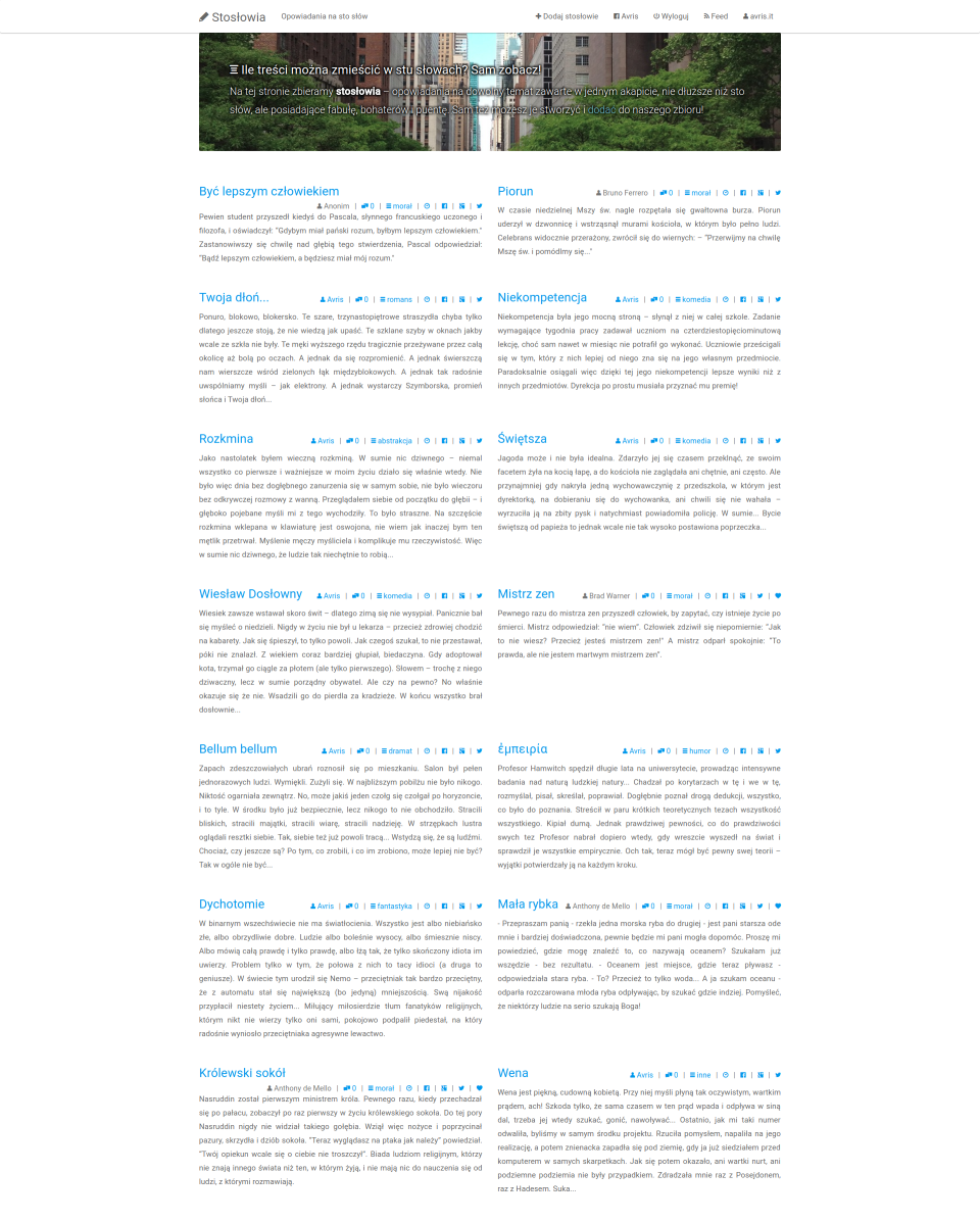
Also to break the monotony, I decided to align the cards in a Masonry manner, instead of just rows.
Within the card, I separated the important info (title, author, category) on the top, from the less important (number of words, date of submission, comments, votes and social buttons) on the bottom.
Categories are pretty important, yet in the old design they weren’t emphasised at all. With the addition of colours they are way more visible, yet to make them even more distinctive and useful, I added icons and a list of all categories on the top.
I added a footer.
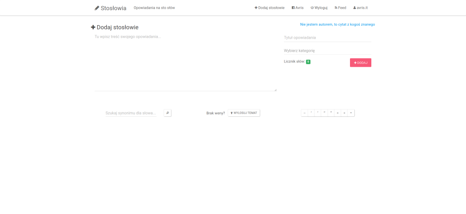
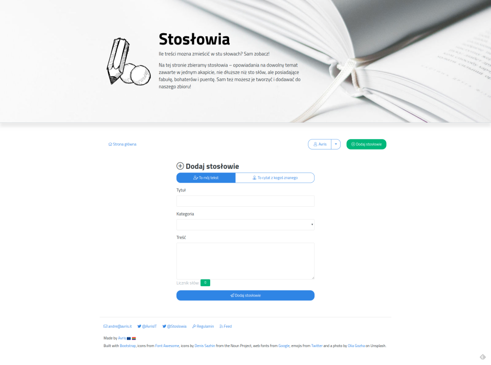
I reorganised the submission form so that it has a simple up-to-down flow, instead of the previous two columns that made it easy to overlook some fields.
Check out the end effect below. What do you think? 😉